OverviewRecommendation cards
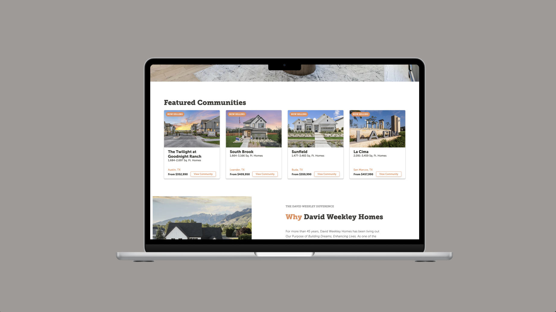
I redesigned a product recommendation widget on high-traffic pages to help users better evaluate homes, floorplans and communities before clicking. The redesign was tested against the original experience to measure its impact on engagement, product exploration and lead behavior.
Focus: product discovery, recommendation UX and conversion optimization.
Details
- Role
- UX/UI design, personalization, A/B testing
- Company
- David Weekley Homes
- Timeline
- 2025
- Tools
- Dynamic Yield, GA4, Microsoft Clarity, Adobe XD, Figma
- UX/UI design
- Personalization
- A/B testing
- Dynamic Yield
- GA4
- Figma
ProblemLow engagement
Product discovery is an important step in the homebuying journey. Our data showed that users who explored home products were more likely to continue through the site and complete a lead form.
One opportunity stood out: the recommendation widget appeared on high-traffic pages, but engagement was relatively low. Users who did interact with it were more likely to keep exploring products and convert.
The challenge was to redesign the experience so more users would engage, without overwhelming them with information.
Research and hypothesisInformation depth
I compared the original widget to other product cards across the site and found a big difference in information depth. Other cards showed bedrooms, bathrooms, square footage, location and price. The recommendation widget showed only the product name, city and price.
I also reviewed how competing homebuilders present recommendation and product-discovery cards. The goal wasn't to add more content, but to find the right balance between useful information and simplicity.
Hypothesis: if we give users more relevant product information in the recommendation cards, they'll be better equipped to identify homes that interest them. That should increase recommendation CTR, product views and overall pageviews.
Design processWithin the brand
Designing within the brand. The redesign had to stay inside the David Weekley Homes brand system, so I focused on hierarchy, spacing, imagery and content organization instead of a new visual direction.
Designing for three product types. The widget supports Move-in Ready Homes, Floorplans and Communities. Each serves a different point in the homebuying journey, so I adjusted the hierarchy based on what's most useful for each.
Prioritizing the right information. I surfaced only the details users need to quickly decide whether a recommendation is relevant to them.
A/B test setupOriginal vs. redesign
I launched the updated cards as an A/B test against the original experience. This let us measure whether the added product information and clearer hierarchy improved engagement and downstream behavior.
ResultsAcross every metric
The redesigned cards improved engagement across every primary metric tracked:
- Product views increased by X%
- CTR increased by X%
- Overall pageviews increased by X%
- Form submissions increased by X%
The strongest takeaway: the redesign did more than increase interaction with the widget itself. Users who engaged with the new experience went further into the site, viewed more products and completed more lead forms.
What I learnedThe right information
Recommendation experiences are only useful when users can quickly understand why something is relevant to them. Adding more information isn't always the answer, but adding the right information can reduce hesitation and help people decide faster.
Small UX improvements at the card level can influence behavior further down the journey. Better hierarchy and context in the recommendations supported deeper product exploration and stronger lead behavior.